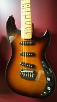
So I've looked all over to find a black body maple neck Legacy and came across this one. However, the Logo on the head-stock looks a bit different than anything I have or have seen on a Legacy. What's the story with this? "Legacy" is plain black and looks misplaced. Also, maybe it's the poor camera quality, but the head-stock shape looks a bit off.
http://www.guitarcenter.com/Used/GL/Leg ... 3090291.gc
What's up with the Headstock logo?
-
DanDoulogos

- Posts: 687
- Joined: Tue Dec 20, 2016 9:08 am
- Location: Canada
Re: What's up with the Headstock logo?
The add describes that one as dark solid blue rather than black - it's difficult to say from the photos...
That being said, the "Legacy" decal does seem to be too near the edge.
That being said, the "Legacy" decal does seem to be too near the edge.
G & L: '08 Comanche (Tribute) | '14 ASAT Classic | '00 ASAT Spec | '21 JB2 (Tribute)
Other: '87 Strat | '05 Heritage CH-157 | '12 Tele Select Koa | '19 MJT Esquire | '18 Taylor | 2015 Chrome Epi Dobro |
Other: '87 Strat | '05 Heritage CH-157 | '12 Tele Select Koa | '19 MJT Esquire | '18 Taylor | 2015 Chrome Epi Dobro |
-
WitSok

- Posts: 635
- Joined: Sat Jun 01, 2013 4:49 pm
Re: What's up with the Headstock logo?
This a Tribute Series Legacy. This font was used on Tributes in the past, not sure when they changed to the font more similar to the USA built units... 2014 or 2015 I think. I'm pretty sure it is blueburst. It is a tough color to photograph. In most adds for used equipment they tend to look black.
Not sure if the name is in the wrong location or someone trimmed the headstock.
Cheers, Dan
Not sure if the name is in the wrong location or someone trimmed the headstock.
Cheers, Dan